Ocularia Vision Center — A Website for Progressive Glasses and Eye Exams

For Optika Ocularia and their Vision Center on Zagreb’s Ilica street I designed a redesign of the visioncenter.hr website, with a positioning you feel in the first second — a superbly equipped centre for progressive glasses. The entire site is deliberately arranged to lead toward one single action: booking a detailed eye examination that takes 60 to 90 minutes and is completely free for clients. There is no webshop and no scattering of attention, because this website does not sell a product online, it sells trust and expertise — thirty-two years in business, a family tradition, and a practice people come to on a recommendation. Everything is built as a bespoke WordPress theme from scratch, with no page builder, so the client gets a light, fast website they edit themselves.
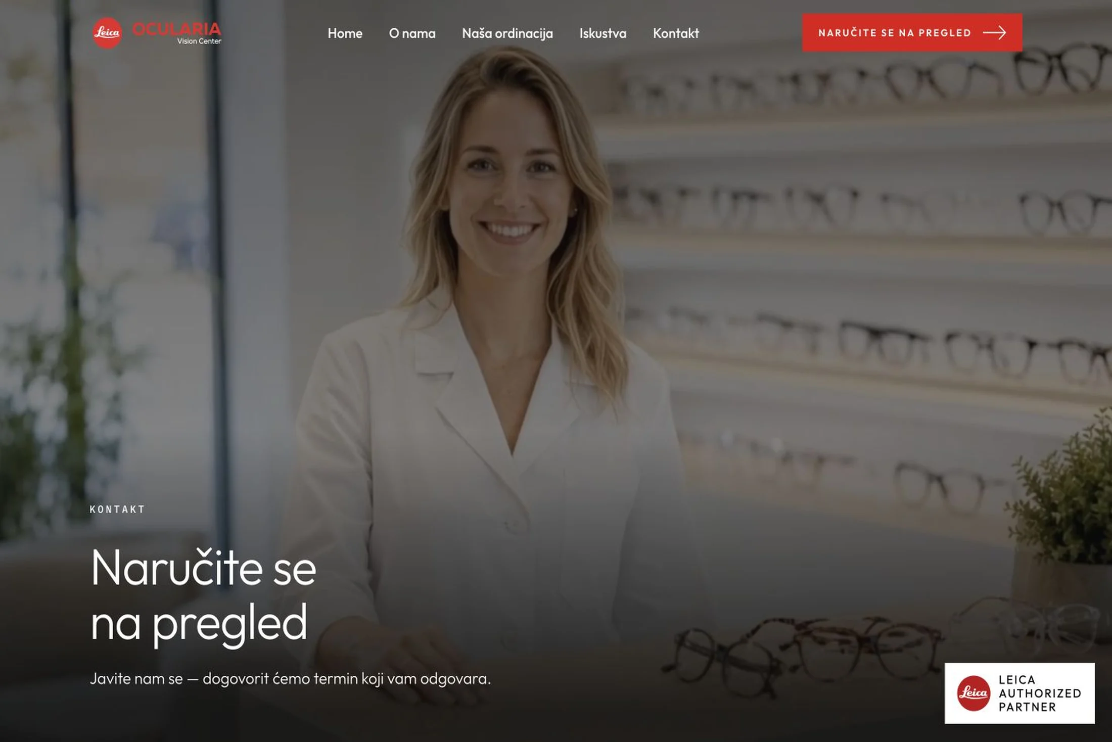
The design language is editorial, warm and deliberately different from the colder, more technical Optopharm site, even though both live in the same Leica world. The foundation is clean white with ink black for text, soft off-white bands that break the rhythm of the page and a deep dark tone carrying the hero, the technology sections and the footer, while Leica red is reserved for kickers, emphasised words inside headlines and the primary call to action. The typeface is Outfit, self-hosted in four weights with not a single call to Google, with headlines in a light cut and negative letter spacing for that calm, premium editorial feel, and widely tracked uppercase kickers above every heading. Content lives inside a 1320-pixel container with fluid margins, and the page is held together by thin hairline rules that always announce the next step, a prominent red arrow button that invites visitors to book throughout the site, and the Leica Authorized Partner mark that sits permanently in the bottom corner.
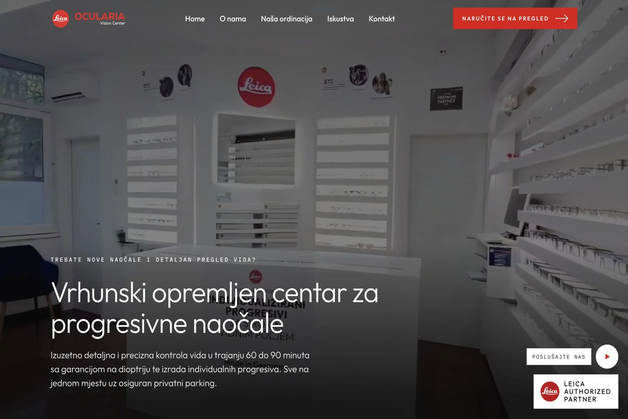
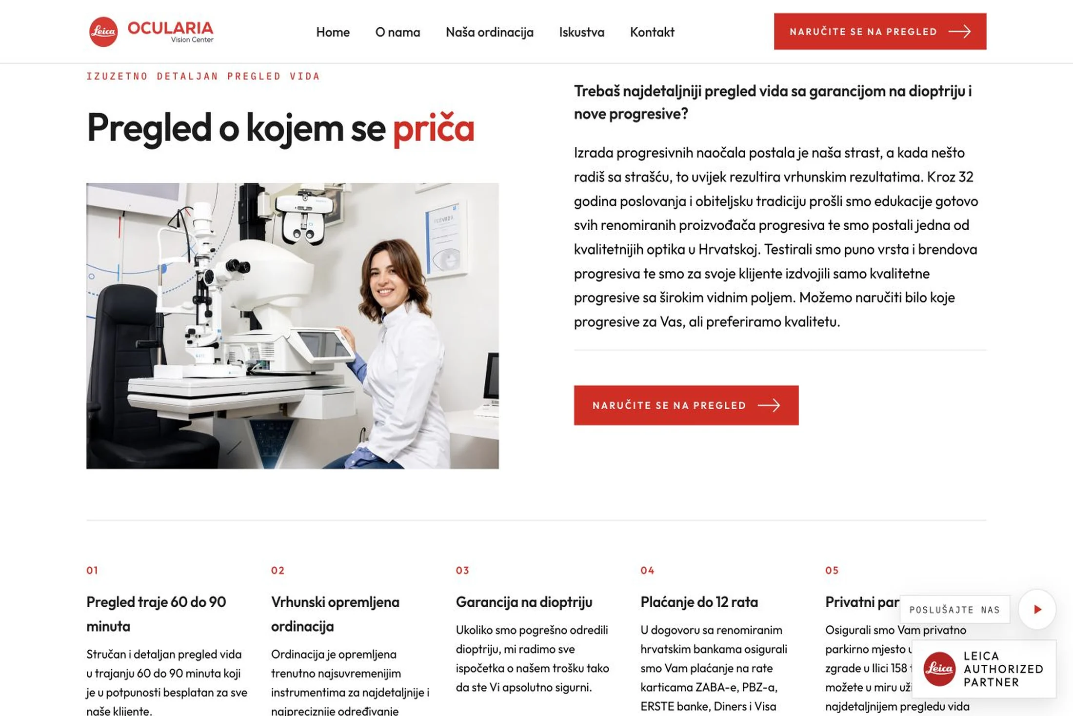
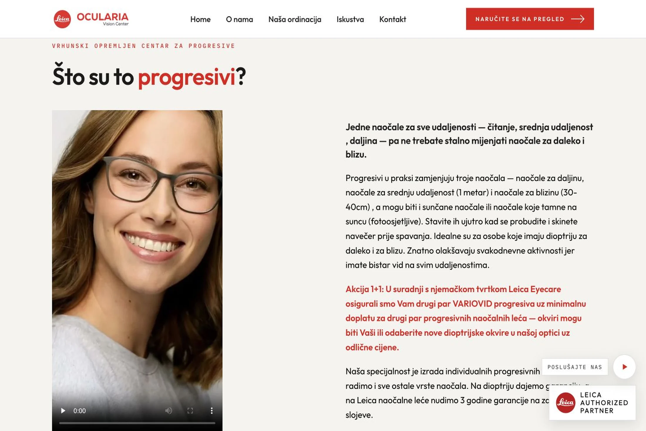
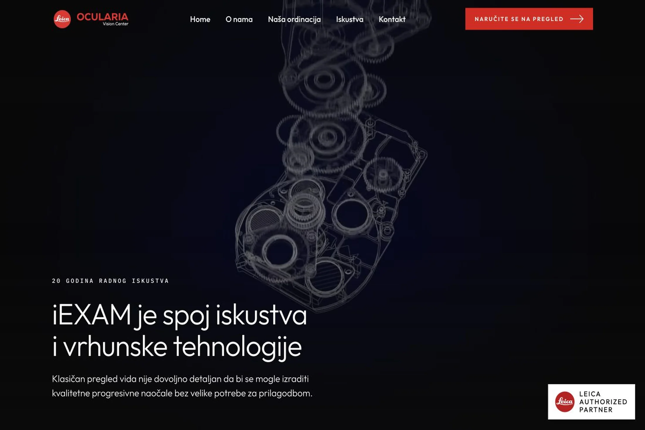
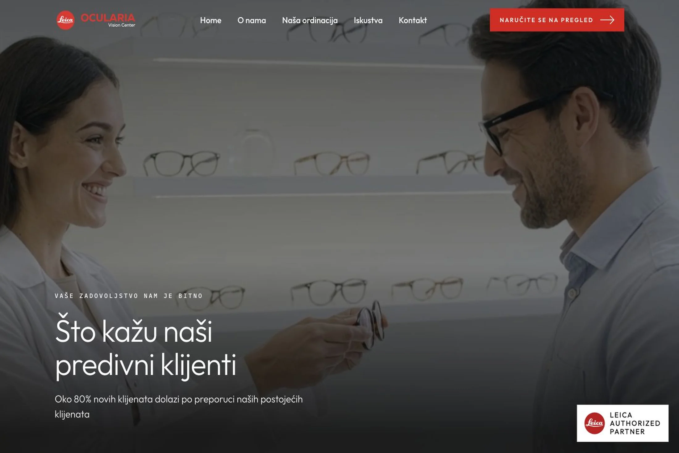
The homepage opens with a full-height video of the practice itself, a gradient scrim that guarantees the text stays readable, and content pinned to the bottom left, aligned exactly with the logo. It is followed by a section explaining why the examination takes 60 to 90 minutes instead of the usual five, with five numbered reasons — a free exam, a superbly equipped practice, a prescription guarantee, payment in up to twelve instalments, and a private parking space — then "What are progressives?" with six Leica lenses, from Monovid and Variovid through Digivid, Monovid Digital, Duovid and Monovid Myopia, alongside a highlighted 1+1 offer arranged with Leica Eyecare. The rest of the site is carried by the About, Our Practice (with its dark iEXAM section and twenty years of working experience), Testimonials — where around 80 percent of new clients are said to arrive on a recommendation — and Contact pages. The fixed header starts transparent over the video and turns white on scroll, swapping the logo through pure CSS, and on phones and tablets it becomes a hamburger menu with correct aria states.
The most interesting part of the project is the interactive lens viewer titled "See the world through a premium progressive lens", where visitors choose the lens category and the addition strength themselves and immediately see how a progressive holds its sharpness from centre to edge. It is built as a self-contained Svelte component with two sliders, where the category marks are rendered as Leica dots that shift from grey to red as you land on them, and the view is composited in real time from four layers: a blurred thumbnail acting as an instant placeholder while the real photograph loads, the scene itself, one of sixteen views matching the combination of four categories and four strengths, and a static lens layer on top. So that switching never stutters, I wrote a smart preloading routine that fetches the first variant of every category in advance, then the remaining variants of the current category, remembers what has already loaded and never fetches the same image twice, and the whole module is fully keyboard operable.
On the technical side everything is stripped to the essential: no framework weighs down the page itself, and all interactive JavaScript is vanilla and fits into about twenty lines — the sticky header, the mobile menu, and a subtle reveal on scroll built on a modern IntersectionObserver that switches itself off after the first animation. Every image is WebP, the fonts are self-hosted, and space for images is reserved in advance through aspect ratios so the page never jumps while loading. The document language is Croatian, the page title and descriptions are written for searches around progressive glasses and eye examinations in Zagreb, the navigation and logos carry correct aria labels, decorative images are hidden from screen readers while meaningful ones carry descriptive alt text, the phone number is click-to-call, and the booking form uses a hidden honeypot field instead of an external captcha service. The result is a warm, human and very fast website that translates Ocularia’s approach to eyesight — unhurried, with full attention — into a digital experience.