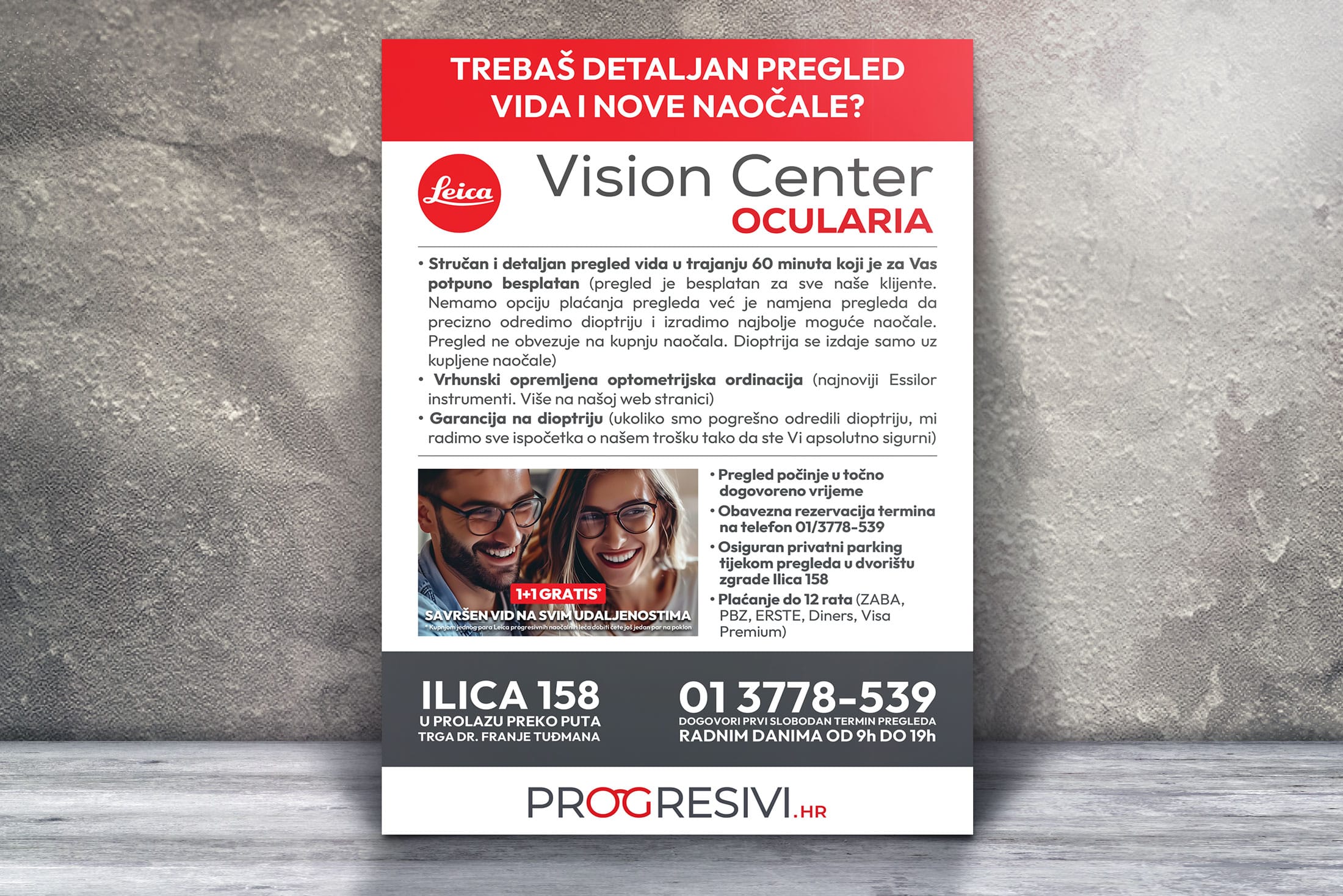


Creating the flyer and banner design for Vision Center Ocularia was a project that combined creativity with strategic branding. The essence of the design was centered around the dominant color red, reflecting the vibrant and dynamic identity of Ocularia optics. At Designer 2, we meticulously crafted each element to ensure consistency and visual appeal.
Our process included custom photography, capturing high-quality images specifically for the banners and flyers. These images were then integrated into the design, enhancing the overall aesthetic and ensuring a cohesive look. The result was a striking and professional visual representation that effectively communicates the brand’s message and appeals to the target audience.
